
Bending the curve - Livelihoods first, climate second
A 5-dimensional view of GDP and GHG emissions

Are we going to fix climate change? Probably depends on what we mean by “fix”.
Bringing down emission levels fast, without disrupting other dimensions of sustainable development may be an agreeable fix. After all we want people to have better livelihoods, leaving poverty and food insecurity behind. Perhaps this is also a recipe for eventually fixing climate change. Livelihoods first, climate second.
Not that angry climate activists would agree - they want drastic action and emission cuts, immediately. But on the other hand, they usually have a pretty good livelihood already. Not poor, not hungry. Livelihood did come first, before the urge to fix the climate.
Perhaps we can find some evidence to support the recipe? Let’s have a look.
Diving into the World Development Indicators database we can find all sorts of data. The World Bank has collected detailed statistics from all countries for decades, and these are official statistics. A treasure for statistics nerds, but not so easy to navigate. Here we will look at combinations of three data points for each country at 1990 and 2023:
Population of the country. Simply the number of people living in the country.
Gross Domestic Product (GDP) per capita at Purchasing Power Parity (PPP) (constant 2021 international $). PPP means that income levels have been calibrated for cost of living in each country, so we get comparable numbers between countries.
Greenhouse gas (GHG) emissions per capita (carbon dioxide equivalents). These are the territorial emissions of CO2 and other greenhouse gases. It does not include effects of trade or the carbon balance in land-based ecosystems. It’s basically fossils burnt, plus various emissions of methane and nitrous oxide, inside the national border. A standard measure for climate impact.
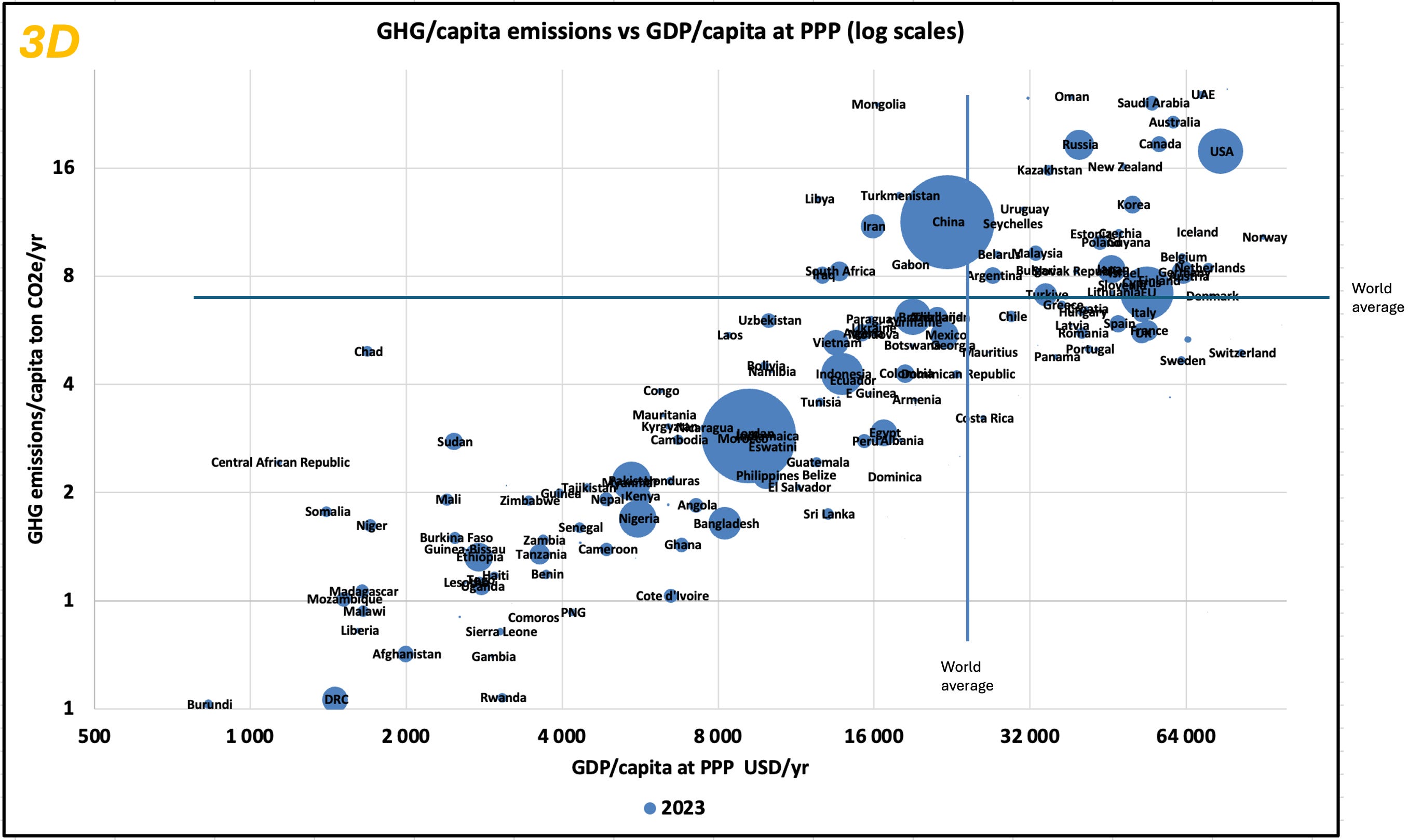
Three dimensions
We’ll start easy with a 3-dimensional plot of these data for the year 2023. The y-axis shows the GHG emissions per capita, the x-axis the GDP per capita and the size of the bubbles show the population of the country. The world average income at PPP was USD 21 000 in 2023 and the average per capita emissions 6.4 tonnes of CO2e.
As you can see there is a very strong correlation between income and emissions. Looking only at this graph, one could start to agree with those activists that say that economic growth is the main problem. Greed grows greenhouse gases - right?
Is the solution then to stop economic growth? But billions of people are at the poverty end of the stick. And economic growth drives change. So it is not that simple.
And also, while United States is suspiciously far up to the right, there are some rich countries that have lower than world average emissions. Clearly, there is more to look into here.
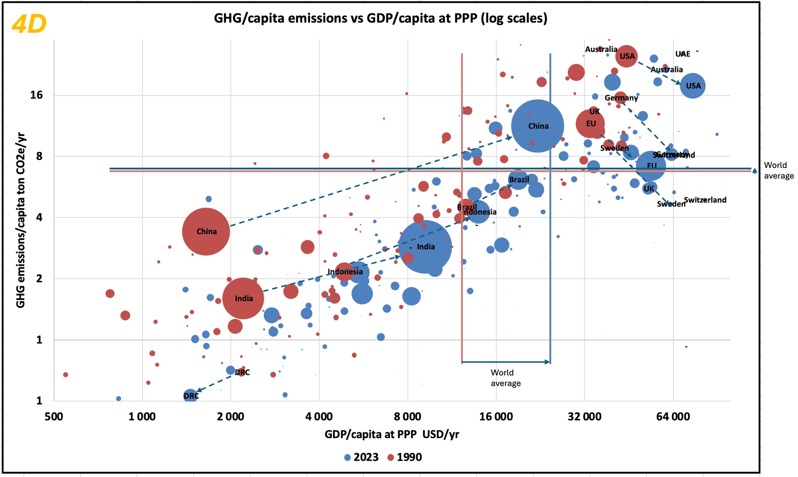
4 dimensions
Let’s add 1990 data to the graph. This gives us a fourth dimension - time. We’re running out of flatscreen dimensions though, so bear with me that the plot is getting messy.
Several new insights come through.
First we can note that the world on average got a lot richer from 1990 to 2023. In fact, GDP per capita at PPP almost doubled from USD 11 000 to USD 21 000. The logarithmic scale makes the difference look smaller, but this is really a major development. Many million people have been lifted out of poverty. Not a bad thing.
Second, the GHG emissions per capita went up, but only from 6 to 6.4 tonnes of CO2e per capita, or about 7%. This is the wrong direction of course. Remember also that population increased from 5.3 to 8.1 billion people between 1990 and 2023. So total emissions are considerably higher in 2023 than in 1990. The population will however increase at a slower pace in coming decades.
Third, emerging economies, such as India, China, Indonesia and Brazil, have increased their per capita income dramatically and at the same time increased their per capita emissions dramatically.
Four, rich countries have also increased their per capita income, but the per capita emissions have declined sharply. Even in the United States. Some of the richest countries, such as Sweden and Switzerland, are now way below the world average emissions. The graph now suggests that there is something in the idea of Livelihoods first, climate second.
Low-income countries - low emissions. Emerging economies - escalating emissions. High-income countries - high but rapidly decreasing emissions.
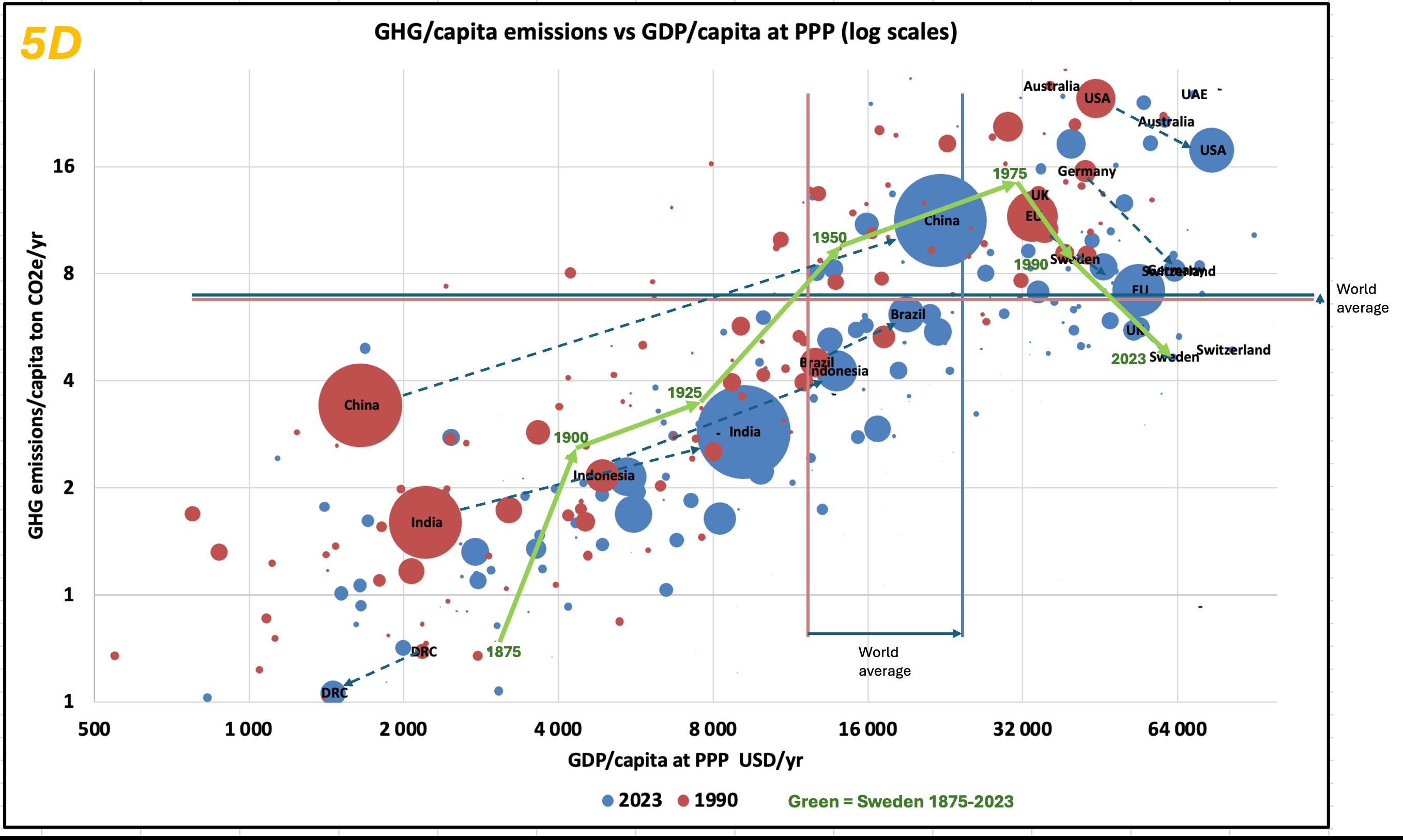
5 dimensions
So are there more data to look at? Digging into some national datasets, it is possible to trace GDP and GHG emissions for Sweden back to year 1875. Adding this time series to the graph gives us a fifth dimension (ok, it is just an extension of the time series, but coming from other sources so let’s pretend it’s now five dimensions).
Sweden was a poor country in 1875, and the GHG emissions were very low. Fair enough, the economy was still largely biobased, but new industries were powered with coal which rapidly increased both incomes and emissions. By early 1970s Sweden was one of the most fossil-dependent countries with very high emissions. And also one of the wealthiest countries at the time.
Following the oil crisis in the 1970s nuclear energy was introduced at scale. In the 1990s, climate policies followed which phased out fossils and phased in bioenergy - which now is the biggest energy category in Sweden. Huge energy efficiency gains brought down emissions per produced unit, Finally new renewables, especially wind power arrived. All in all, this has led to much lower per capita emissions in 2023. What remains is largely emissions from transport, steel industry and cement production.
So there seems to be a strong case for Livelihoods first, climate second. What we need is patience, and to handle adaptation to climate change.
We are making progress. Maybe not as fast on emissions as climate proponents advocate for. And maybe not as fast on the economy as poor people would like to see. But on balance, not too bad.
There is a lot to say about de-coupling and what is meant by it. But two aspects are almost always missing from the debate.
1. the GDP is generated in value chains and not in territories. Apart from the apparent case that many rich countries import a lot of emissions with the stuff they consume, and even more important aspect is that they command a much bigger share of the value in global value chains. To put it in an example. When a clothing item of H&M is sold, much of the value is accrued to H&M and little value to the producers. That value is allocated to the GDP in the country where the value is generated.
In a ground-breaking study 2018, Pablo Piňero and colleagues showed that if emission of a value chain is distributed according to the value created in the various stages, countries like Sweden and Germany would cause much higher emissions. In the Swedish case, the emissions based on value addition are 42 percent higher than when calculated based on consumption and 53 percent higher than if you calculate territorial emissions. https://gardenearth.substack.com/p/why-decoupling-will-not-happen
2. Already the measuring of the GDP a given year has its caveats, but comparing GDP over time introduce many shortcomings. In particular the use of physical volumes (quantities) and subjective quality into calculations resulting in monetary values. I explain that in more detail here: https://gardenearth.substack.com/p/can-you-trust-the-gdp-growth-figures